iOS 14 vs. iOS 13: Widget systems in comparison
A ADVICE from David Haydl ![]() on September 22, 2020, 10:30 am | Write a comment
on September 22, 2020, 10:30 am | Write a comment
With iOS 14, Apple introduced new widgets. But how do these differ from those in iOS 13.
With the new widgets, Apple wants to ensure that they look good in the Today view and directly on the home screen. Developers can offer widgets in several different sizes, which can be very useful as it gives you more flexibility in arranging the boxes. There is one limitation, however: interaction with the widget is not allowed. It can either display data or link to an area in an app.
Jump to section
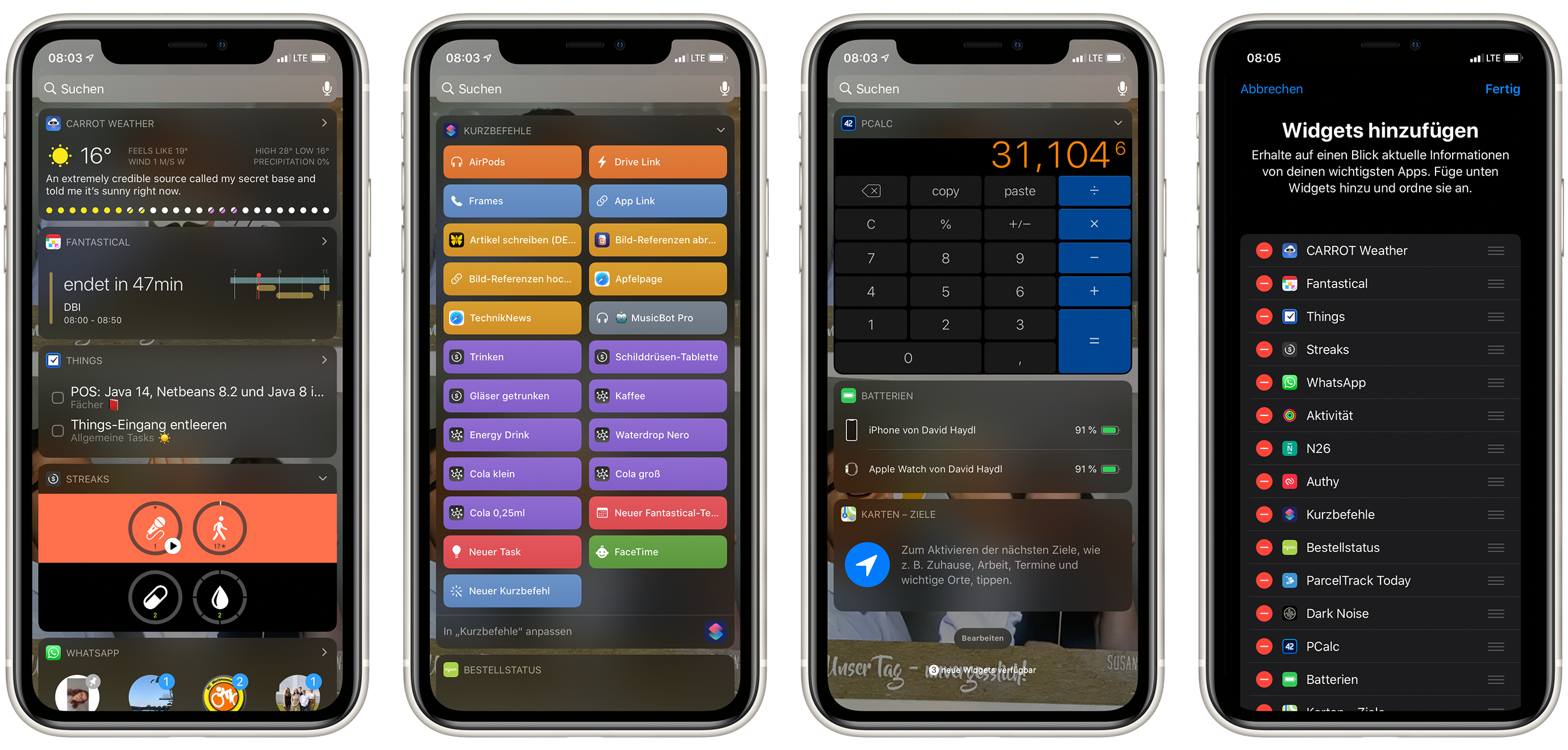
Those were the widgets in iOS 13
In iOS 13, widgets lived only in the Today view. With the iPad you could also pin them on the left side of the first start screen. Because they could only be found in the Today view, many users paid no attention to them.
developers could pro App also only offer a widget. You also had to determine the size of this one. This means that the user had to put up with whatever the developer felt like doing. Customize widgets? None!
Screenshots: TechnikNews
One advantage, however, was that you could interact with widgets in iOS 13 - they could be real “mini apps”. The calculator app PCalc, for example, offered a simple calculator as a widget.
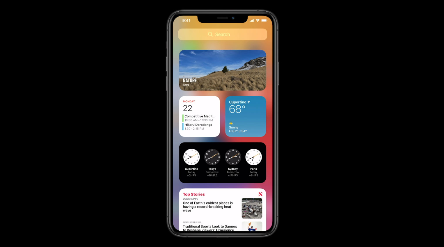
This is what the widget system in iOS 14 brings with it
As already mentioned, Apple introduced WidgetKit with iOS 14. This makes it easier for developers to create widgets.
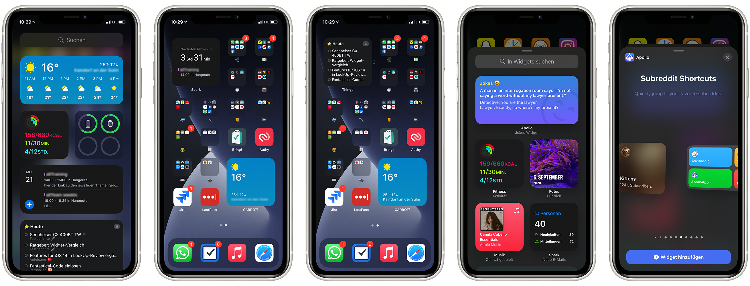
There are three different sizes in total, "Small", "Medium" and "Large". As a user, you can select all sizes for which the developer has built a widget. In addition, several widgets can be selected from one app and placed in different places. Depending on the size, a different number of things are usually displayed in the widget.
Screenshots: TechnikNews
For the first time, these widgets can also be placed on the home screen, although this is only possible on the iPhone. They cannot be arranged freely either, as the position is based on the position of other app icons. Widgets of the same size can also be grouped for better organization, which can be particularly useful for those in the Shortcuts app. There are also smart groups, whereby the system can be determined using various parameters (e.g. the time of day). proasks which widget should now be at the top of the group.
As already mentioned, interaction is no longer possible. But why is that? Let's say widgets can work the same as the ones in iOS 13. When there are many such small mini-apps on the start screen and constantly running in the background in order to be able to process inputs at any time, they demand performance.
Conclusion
The widgets in iOS 14 are very handy. The fact that you no longer have to switch to the today view to see the next appointment in the calendar saves a lot of time in the long run. So they are much more accessible than before. The new designs also often look a lot fancier than the old ones.
However, there are some weak points. Smart groupings work less well at the moment, as the system often simply gives priority to some widgets, although these are actually not relevant at the moment. In addition, some apps still have to deliver their widget. Many developers were overwhelmed by the surprising release date of iOS 14 and iPadOS 14. In the meantime, apps like Widgetsmith and Widget Wizard allow you to build your own widgets. And last but not least, I would also like to be able to position the widget freely on the iPad.