Gmail for Android and iOS: New material design is on the way
from David Wurm ![]() on February 21, 2019, 19:10 am | 🔥 popular | Write a comment
on February 21, 2019, 19:10 am | 🔥 popular | Write a comment
A few weeks ago, Google launched a Update for the Gmail app for Android and iOS versprochen. Now you redeem this and distribute a redesign of the app on the first devices.
With the latest update there are unfortunately no new functions, only a new design is used. This is the current look (also material design), which is used on several Google services. So you are working on an overarching, identical design. In general, the mobile design is now more similar to the Web version of Gmail.
More noticeable warning of dangerous emails
In addition to a new, more conspicuous warning of dangerous e-mails, there are a few practical innovations. You can now see a brief preview of emails with attachments. In addition, some dividing lines and spaces have now disappeared to tidy up the design of the app. I personally like the new look and it makes a fresh impression. Some buttons are now a little more white, while others are a little more colored.
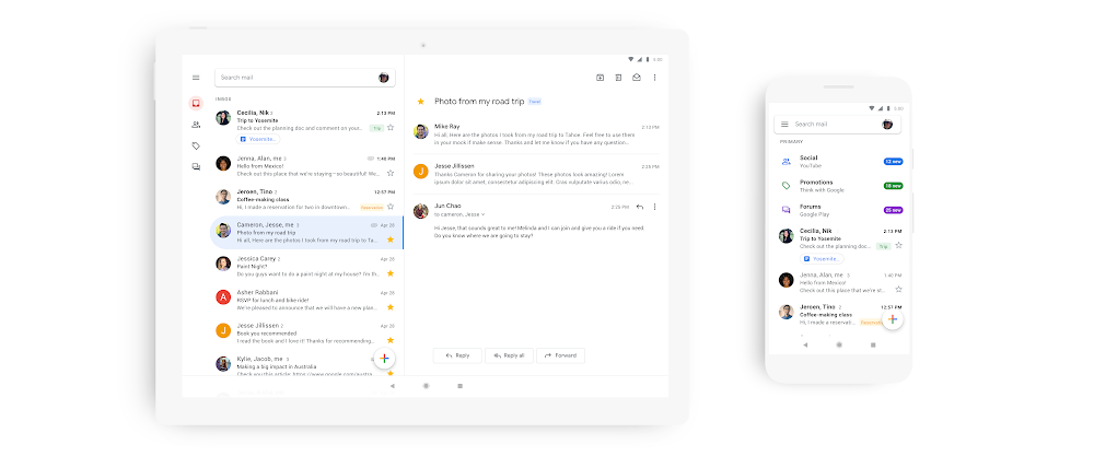
Image: Google Blog
The update will be available to all users of the Gmail app for Android and iOS in the coming weeks. Some users have already received the update by downloading the latest version from the store and opening and closing the app several times. For others, however, this trick didn't work.